
You know how frustrating it is to spend hours working on that landing page or on that campaign and have it fail because of one minor detail that you’ve missed. Most marketing campaigns fail within 3 months of launch. Unfortunately, that happens all the time with marketers. After all, the success of a marketing campaign is in the details.
With that said, I wanted to show you strategies that I’ve seen that actually work and that you need to know. These optimization strategies will bring you tangible results. All I ask is that you pay attention and try them for yourself.
A simple change in the color of a button can make the whole difference in your conversion numbers. The size of your font may also be responsible for an increase in sales. Those things matter because they play a part in the subconscious decision that customers make before buying a product.
So, I’ve gathered 30 strategies that will make sure that you don’t miss the mark this time. I present you with 30 conversion optimization strategies you need to know. With them, your sales will happen regularly.
Pro Tip: I use SEMRush to automate my marketing
You can try Semrush for free here.
Every business creating PPC ads must how harness conversion optimization to maximize the value obtained from each and every visitor.
OK, now let’s get started with my top 30 conversion optimization strategies!
1. Increase Your Conversions by 33% With an Updated Design
If you have had the same website design for a while, this being for a few years, updating to a new design will increase your conversion. Nowadays, things change really fast, and having a design that follows the latest trends and brings something new is key to better conversion numbers.
Research also shows that novelty makes people more interested and more open to making a purchase. This means that you’re not only going to convert better new visitors but will get a second chance with the ones that already follow your website.
So, to achieve the 33% increase make sure that your new design has enough CTAs, testimonials, and maybe a free demo offer. The investment that you’ll make in the new design will pay itself with the increased conversion rate.
2. Make Your Copy Action Oriented

To pull this off, you’ll need a copywriter that pays attention to every single word that is being used in the copy. This is due to certain words causing a bigger impact than others.
For instance, action verbs are a great start. Whatever it is that you ultimately do, make sure that your copy is action-oriented. It has to not only point the reader in a direction but also compel them to take the action.
Companies reported a 40% increase in their conversion with a simple tweak on the words. Changes like “eliminate” instead of “lose” or “reduce” proved to improve numbers significantly.
3. Make It Relatable With A Picture Of A Person

People love to buy from a business that they trust. A great technique to build that trust and make your brand more relatable is to use a picture of a person on your landing page.
Use the picture of a person, preferably someone smiling, to add a personal touch to your campaign. It can be either an imaginary customer or someone from your company, depending on what kind of service or product you sell.
The key finding is that a picture of a person makes the offering more interesting to people and captures their attention better. Websites that use this technique tend to have a better bounce rate.
4. Add Targeted Testimonials to Increase Conversion by 34%
Testimonials are not a thing of the past. Even though they don’t hold the same power as the one they had at the beginning of the World Wide Web, they still give assurance that your product is good and trustworthy.
Now, it’s important that your testimonial comes with the customer name, and if you can, a video. This is an extra touch to show the lead that your product is legit.
Implement testimonials after the hook of the copy and as a way to get rid of possible objections that clients may have. If you want the legitimacy of your brand, it’s important to use real testimonials.
5. Have A Security Seal

A security seal or a badge of trust, it’s a symbol that shows that important companies specializing in security trust your website. This shows that people will give you their money and it’s guaranteed that they’re going to get what they’re paying for.
This is the most important step to showing trust in the market and transparency of your business. In turn, this immediately optimizes your conversion because people now know they can trust your brand.
Having a security seal has proven to give you a conversion bump of more than 5% immediately and even more after a few months.
6. Adding A Guarantee Increases Sales

Adding any form of guarantee increases sales immediately. E-commerce has been around for a few years now, but a lot of people still raise their eyebrows at it. The reasons are that people either don’t know much about buying online or they’ve heard about too many frauds.
So, the best way I’ve seen work countless times is to implement strategies that’ll help you build trust with the lead. To do that, you need to give a guarantee to the prospect. This can be a money-back refund or any other form. Like a return, if they don’t have a result.
As long as you can make sure that your product will work or they’ll get their money back. In most cases, even if people don’t like a product they rarely ask for a refund. The important thing is that you assure them, that doing business with you is safe.
7. Make CTA More Prominent
Have you ever ended up on a landing page and had to scroll down for far too long until you were able to find the CTA or the buying button? You’re not alone, this happens too many times.
This is a rookie marketer mistake that you can easily fix. The point is that not everyone will want to read your entire copy to make a buying decision, so the more time you can save prospects the more likely they are to buy from you.
With today’s attention span and impatience, people won’t hesitate to leave your page. So, don’t give them a reason to. One company experienced a 591% increase just by making their CTA easy to find.
8. Video Increases 100% Email Signups

Video content is powerful. It captures the attention of the lead faster and better than text. Now, the video does work for any kind of landing page, but it works better for certain types.
In the case of email signups, it works like magic. Having a video explaining what your business is about and giving them a thorough introduction has been shown to increase your email signups, thus converting better.
The secret is to make a concise video with nice editing to keep the attention and not bore the viewer. Give the message that you need and make the CTA easy to find as well.
9. Experiment With Button Copy

This is one of those tips that don’t seem that relevant but can make a whole lot of difference. The copy that you choose to write inside the action button matters. If you say “buy now” or “get started now” matters more than you think.
Converting leads is an art form. You have to think about every single detail to make sure that your visitors take the action you want them to take. For this reason, you must pay attention to the things you believe aren’t that important.
So, the button copy has to be written with words that entice action and are persuasive. Test out different versions and see what converts your audience better.
10. Understand Your Audience

This strategy isn’t as practical as the others, but I believe is important to be here. If you want to sell a product in any niche, you must truly know it inside out. You must understand the needs of your target customer so you can provide exactly what he/she wants to buy and not what you think is good.
So, the practical advice that you can take is to study your audience. Become an expert on them, not necessarily the niche. This means that you should be an expert on the customer and not the product.
Go to online forums, social media groups, and anywhere else that your audience hangs out online.
11. Customer Reviews Increase Sales

Customer reviews are like testimonials, they work like a charm. Still, they lost some of their efficiency due to scandals in recent years with fake reviews on websites like Yelp and Amazon spite the many attempts of the latter to ban those reviews from their platform.
Now, customer reviews still do increase sales. It holds the power to optimize your conversion strategy. If you don’t have them on your landing page, you should implement them right now.
If you already do, you can experiment. Optimizing whatever it is that you already have, will take time and a lot of testing. So, the best you can do is to use different reviews and place them in different places throughout the copy.
12. Make Adjustments To the Design and Copy

The secret to a successful marketing campaign is to test things out a lot. This also means that you should do your best to try out different designs and different copies. Even if you’re doing fine with your numbers.
Tweak the details until you get to a number that you consider to be ideal for your campaign. The money that you’ll spend on design and copy will pay itself later. The goal at this stage is to optimize everything to make the most profit possible down the road.
13. Graphics Presenting Value Increases Conversion

People love graphics. There’s something about presenting numbers and benefits in a visual fashion that convinces people right away. The power of persuasion of graphics is undeniable.
For this reason, you cannot afford to not have them on your page. The best graphics are the easy ones to understand and that use big numbers. It can be the percentage or just the numbers that the person will get from your product.
14. Emphasize Free Trial and Demo

If you just have a “signup” or “get yours now” sign, you’re likely to not convert as much as you could. This is a simple rookie mistake that I’m going to make sure you don’t make again.
If you use any kind of language like that, people assume that they have to pay for the service right away. Not only that, but they assume that it’s expensive. These are 2 objections that you can get rid of immediately.
Offer a free trial or demo, and make sure to include those words in the button copy. Just like that, you get rid of both objections instantly.
15. Test Product Density
Companies have been using this technique for decades. The reason is simple; it works. Software companies and people selling courses are the 2 niches that profit the most from this.
All you have to do is to offer different versions of your product with different price tags. You usually go for 3 variations.
With the basic, normal, and premium versions, you can get people to pay more because you’re covering different budgets, thus increasing your customer base.
16. Use High-Quality Videos

Videos are not only a great content tool but also a great marketing tool. Using high-quality videos to increase conversion is simple. You record a video that can be used to present your service or product or of customers talking about it.
Recently, a data journalist agency made a high-quality video using their own freelancers to present the advantages of being part of the team and another video to convince clients to hire them.
It’s important to point out that high-quality means not only the images but also the content of the video. Make sure that you have creatives thinking about the best ideas to convert better.
17. Test Different High-Quality Images
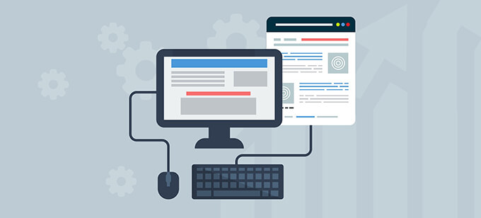
Long were the days when all you need was to write great copy and wait for amazing results. Due to competition and behavioral changes in the customers, you need more than just amazing copy. You need images.
I’m not talking about any kind of image. I’m talking about high-quality images that are able to give a concise idea of what your business is about. Here, the less generic you are the better.
This is the area where you should test hundreds of different options until you find something that can give you a conversion bump in the high 2 figures percentile.
18. Offer Coupon Codes or Discounts

Most people react like crazy when they see a discount. This is the technique that supermarkets have used for ages. Sometimes the product is not even that much cheaper, but if you see the 5% off, it’s enough to trigger something in your brain that makes you want to buy it.
So, this technique is really simple. Offer discounts and coupon codes for your product or service. This will immediately grab your lead’s attention and improve your current conversion rates.
19. Make Comparisons With The Competition

If you don’t feel comfortable with naming the competition, it’s okay. You can still do this by comparing your price or product offering with the competition without naming them.
What is important here is that you show the prospect how your product is superior or will offer them something better. Graphics and checkboxes are great additional cues to use with this technique.
Now, it’s important that your product comes out on top, as long as you don’t lie since people can find out with a simple Google search, and you’d lose all the trust you built so far.
20. Optimize for Mobile Devices
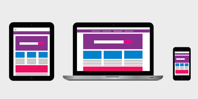
More than half of online traffic is mobile traffic. This means that you’d be losing more than 50% of leads if your site isn’t optimized for mobile devices. This cannot be stressed enough how much it is important that you follow this technique to the letter.
You can hire a developer or buy software that will do all the jobs for you if you don’t know how to do it yourself. The important thing is that you do it. You’ll be leaving too much money on the table if you don’t.
21. Give Value First With Amazing Content
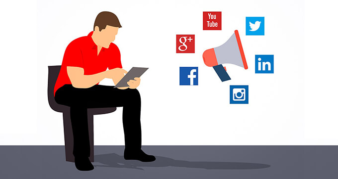
Creating amazing content is the new selling. Companies are taking a while to catch up, but they’re finally understanding that providing tons of value upfront is the best way to sell online.
Invest in having great written, video, and audio content on social media and your company’s website. Hook people to what your brand is about and they’ll be excited to do business with you.
Focus on solving people’s problems and answering questions that your customer base has and your service solves. Have your content strategist do that and set it up to sync it with your marketing campaigns.
22. Have A Browser Abandonment Campaign
This is an amazing technique because is easy and cheap to implement and increases your conversions by a large measure. A browser abandonment campaign will make a popup show up either after a visitor gets to a certain point on your page or after the visitor tries to leave.
This works like magic because some visitors are ready to make a purchase or signup, so you convert them right away without the need to lose their enthusiasm. If the visitor is trying to leave, you try one more time to win them over.
It’s like the salesman that asks you if you’re sure that you don’t want it. Just a simple question might make the indecisive customer reconsider.
23. Personalize Everything For Your Customer

Personalization is the best technique to stand out from the competition. When people are able to identify your brand against your competitors, you hit gold.
The first thing is to personalize the copy. You have a huge variety of software that you can use to personalize email messages to your list. Then, you go to the next layer which is personalizing the copy in the sense of describing what your subscribers need.
Also, personalize the design and the offering. This will all take extra time, but it pays itself if you take the time. It’s worth it.
24. Redesign The Site Every Year
You don’t need to change your design necessarily every single year, but you have to redesign it constantly. Changing color schemes, fonts, and button designs have shown to increase conversions.
There are 2 major reasons for this. First, you’re introducing novelty to your current audience. They’re seeing that you keep yourself and your business updated on the latest trends. Then, to new visitors, you tweak details and find something that works better than what you had.
It’s a new investment that you’ll have to make, but the bump in your conversion numbers justifies the trouble. If you schedule the redesign of the pages with a certain frequency, you can even pay less for the service.
25. Showing The Price Doubles Lead Generation
We tend to think that if you show the price right away, we’re going to scare customers away before they give us the chance of telling them how great our products are. That is simply not true.
Here’s the thing, if you show customers the price of your product before they have to go deeper into the sale pipeline, they’ll know whether or not they can afford it. This way, you also eliminate the ones that are not interested in paying your prices.
Studies show that people think that when you don’t show the price, it means that it’s too expensive. So, they don’t even bother clicking further.
26. Clean Your Home Page

Visual stimuli work amazingly well, but if you give your audience too much, it’ll overwhelm them. This means that a cleaner home page works better than a page full of images, graphics, numbers, colors, etc.
A clean home page has proven to convert better in any niche. When you give focus to only one main image or graphic on your page, you’re able to persuade better and really convey your message.
This increases conversion immediately. So, take a look at your current home page, and think that less is more. Take everything unnecessary off the page.
27. Having a Less Generic CTA Increases Conversion by 22%

Spending money is oftentimes, an emotional decision for people. To convince them to give you their money, you have to make your product about them.
What you also have to make about them, it’s the marketing. How you present the product is as important as the product itself.
So, your CTA has to be specific and not generic. Saying “buy now “or “get started now” works but isn’t the best option you have.
Being specific on your CTAs have shown to increase your conversion by 22% for many companies. All you have to do is to tailor it to your customer base.
28. Test Short Landing Page
Short landing pages have been shown to work better nowadays. Obviously, there are exceptions, but people’s attention span is getting worse. So, a short, concise landing page that is effective but short works wonders to increase your conversion.
This is one of the best conversion optimization strategies out there. Instead of writing dozens of pages, thinking that they will make you increase conversion, cut down all those words.
Make the message clear and short. Test different headlines until you find a winner. The important thing is that you test things, at least, a dozen times to find what works better for your brand.
29. Test the Long Home Page

Now, when it comes to the home page, case studies have shown the opposite. Long home pages work better than short ones. This is because when visitors are on your home page, they want information about you and not to be sold on something.
Still, you can craft an effective home page to sell them on you and what your business represents, but it’s not their brain mode at that moment.
So, have your copywriter craft something that explains at length what you and your business are about. Give all the relevant information without being boring or extending yourself for too long.
30. Get Rid of Customer Objections
One mistake that every business makes in its early stages. They forget to get rid of customers’ objections. The reason usually is that you as the owner are in love with your product. So, you forget that people might have an objection to buying it.
Now, when you take a special section in your copy and your landing page as a whole to deal with those objections, conversions usually go up by a large margin.
Start with a list of every possible reason that someone would not buy your offering immediately, then tackle all the relevant ones in your copy in a persuasive way.
Conclusion – Final Thoughts
So, these are the 30 conversion optimization strategies you need to know. Implementing is the key, if you implement these techniques correctly, they’ll increase your conversion rates dramatically. Many of them will give you results right away and some might take as long as 30 days.
Now, do you see a great idea missing? Let me know by hitting the contact button above.
Summary
Article Name: 30 Conversion Optimisation Strategies you need to Know
Description: Every online business must how to harness conversion optimization to maximize the value obtained from each and every visitor. Here are my top 30 strategies you can implement right away.
Author: Buff Marketer